With a first glance at the title, you might wonder: Who uses business cards anymore?!
While that might be true in some regions of the world, one of our first lessons in Southeast Asia was the importance of business cards. As a college student, I have been to career workshops in school that devote entire sessions on how to stand out using your business card: from creating a unique design to the way you hand the card to someone you have just met.
So let’s get down to business:
- The vertical layout: Usually business cards are horizontal. But if you think about it, the horizontal design does not optimize space. Even if you add details in two columns to use the space effectively, it looks odd. The advantage with the vertical design is, there is plenty of space to add in contact links (LinkedIn, Facebook, Twitter), while also standing out from the other, conventional, horizontal layouts.
- Add in your picture: Most business cards have the company’s logo on it. Which is why putting a picture of yourself on the card makes it stand out. Agreed, it takes up inches on your card. But if you can get someone to tag your face to the name, then the purpose of your business card is fulfilled.
- QR code: In keeping with the times, a QR code linking to your social media pages or a discount platform on your website will pique interest in your business-card-receiver. It could even link to a landing page which allows you to keep track of who is receiving and looking at your business card. Make sure it works though! You don’t want this to turn into an embarrassment.
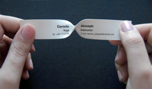
- Radical designs: This one requires some thought. A banker with a radical business card probably won’t go very far, but if you’re in the restaurant business or any creative industry, it’s worth exploring ideas that can make your card stand out. You can break off from the rectangular layout and try a layout that makes your business
self explanatory. For example, a yoga centre made their business card look like a yoga mat; a bakery made their business card look like a cookie cutter. You can explore with materials as well: there is no rule that says it needs to be made of paper.
- Offering your card: Knowing how to give your business card is as important as the card itself. Try not to make it look like your card is given to just about anybody. It’s a unique marketing tool that is handed to someone deliberately and with great regard to who it goes to. Giving it with both hands is a sign of reverence. It also helps if you have a hook when you offer your card, maybe a memorable catch-phrase or a joke. I know, it sounds cheesy, but again, if you can get someone to tag your face to your name, then that cheesy joke is worth a shot.
Bonus Points: In Asia, many people refer to “business cards” as “calling cards”.
Hope these 5 points help. Let us know if you have any more ideas on business cards that stand out.

